As you work with paint, colored pencils, pastels, or even digital illustration, it’s important to understand color and value. For this lesson, you will need:
SUPPLIES
• Watercolor Paints
• Watercolor paper – 3 half pages per student, 2 of them taped to cardboard
• Brushes
• Containers with water
• Paper towels
• Styrofoam plates
CREATING DIFFERENT VALUES
VALUE refers to the degree of lightness or darkness of a color. When the shade of a color is darker, we say it is LOWER in value; when the shade of a color is lighter, we say it is HIGHER in value.
1. To begin, draw five squares on your paper, all about the same size and the same distance apart.
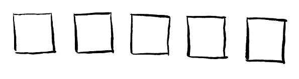
2. Next, choose one color you want to use.
3. After dipping into the water, dip into the color you chose, loading your brush with a lot of paint. Fill in the first square on the left.
4. Dip into the water again, but this time, don’t dip into the paint. Fill in the second square from the left. This shade will be lighter, or higher, in value.
5. Now, dip into the water again. Don’t dip into the paint. Fill in the third square from the left. The shade is lighter still.
6. Finally, dip into the water one more time without dipping into the paint. Fill in the last square. The color in this square will be the lightest shade of all.
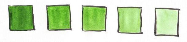
Tip: If the squares didn’t turn out quite right, don’t worry! You can make the color darker by adding more paint, lighter by adding more water.
WARM AND COOL COLORS
WARM COLORS are colors based on yellows, oranges, and reds – the colors you think of when you imagine a warm place, such as a desert.
COOL COLORS are colors based on greens, blues, and purples – the colors you think of when you imagine a cool place, such as a the icy South Pole.
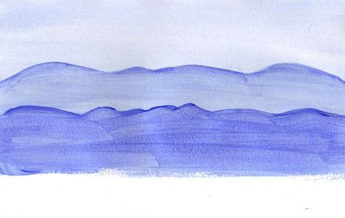
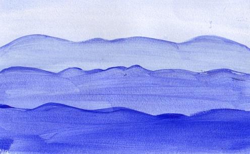
To see the difference in warm and cool colors, paint the mountain scene below, using a COOL color the first time, then a WARM color the second time. Because you are completing each painting with only one color, it’s called MONOCHROMATIC painting (“mono” meaning “one”; “chromatic” meaning “color”).

Notice that the lighter mountains appear to be further away, and those that are darker appear to be closer. Lighter values move back while darker values come forward.
1. Place a cool color, such as ultramarine blue, on your palette. This blue is a good choice, as it easily goes from light to dark in value.
2. On one of the ½ sheets of paper, begin painting from the top and move downward about 1/3 of the page. Add a lot of water to the blue to make it very light. Paint the top portion of your paper.
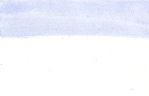
3. While the “cool” painting is drying, begin painting on your second ½ page. Here we’ll paint the same picture, this time using a brown, such as burnt umber. Again, lighten the paint with water, then paint the sky, going from the top downward about 1/3 of the page.
4. While the warm painting is drying, let’s move back to the cool mountains. With a little more paint on your brush and a little less water, paint the mountain furthest away. This should still be light in value, but darker than your sky. Make sure it overlaps the sky. 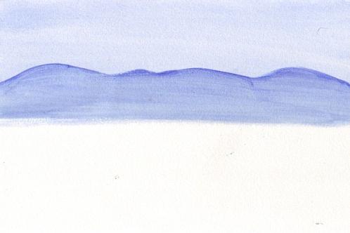
5. Repeat Step #4 for your warm mountains while the cool painting is drying.
6. Go back to the cool painting and add another mountain, this time with even less water and more paint, making it lower in value (darker). Paint this mountain, allowing the top of it to overlap the bottom of the previous mountain.
7. Repeat Step #6 for your warm painting.
8. Add one more mountain, this one with more paint and less water than the one before. By making this one darker, you will make it come forward on the paper.
9. Repeat Step #8 for your warm painting.
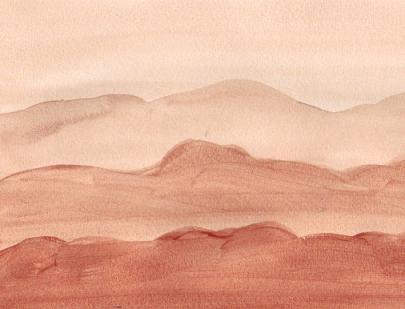
Compare your cool painting to your warm painting. Can you “feel” the difference in the colors?
Please note: Only family-friendly comments will be published.